PROCESS
& SNAPSHOTS
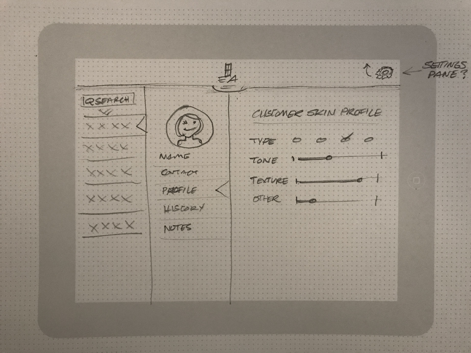
This is a place for rough sketches, iterative/progress states, and random examples of unpolished work to offer a glimpse into how I’ve worked in the past. More coming soon!
With formality depending on the project or organization, I've used a design process that goes something like this:
Define the Issue(s) ➞ Collect Information ➞ Brainstorm ➞ Develop Solutions ➞ Design Crit / Gather Feedback ➞ Improve ➞ Repeat ...and always ask questions!
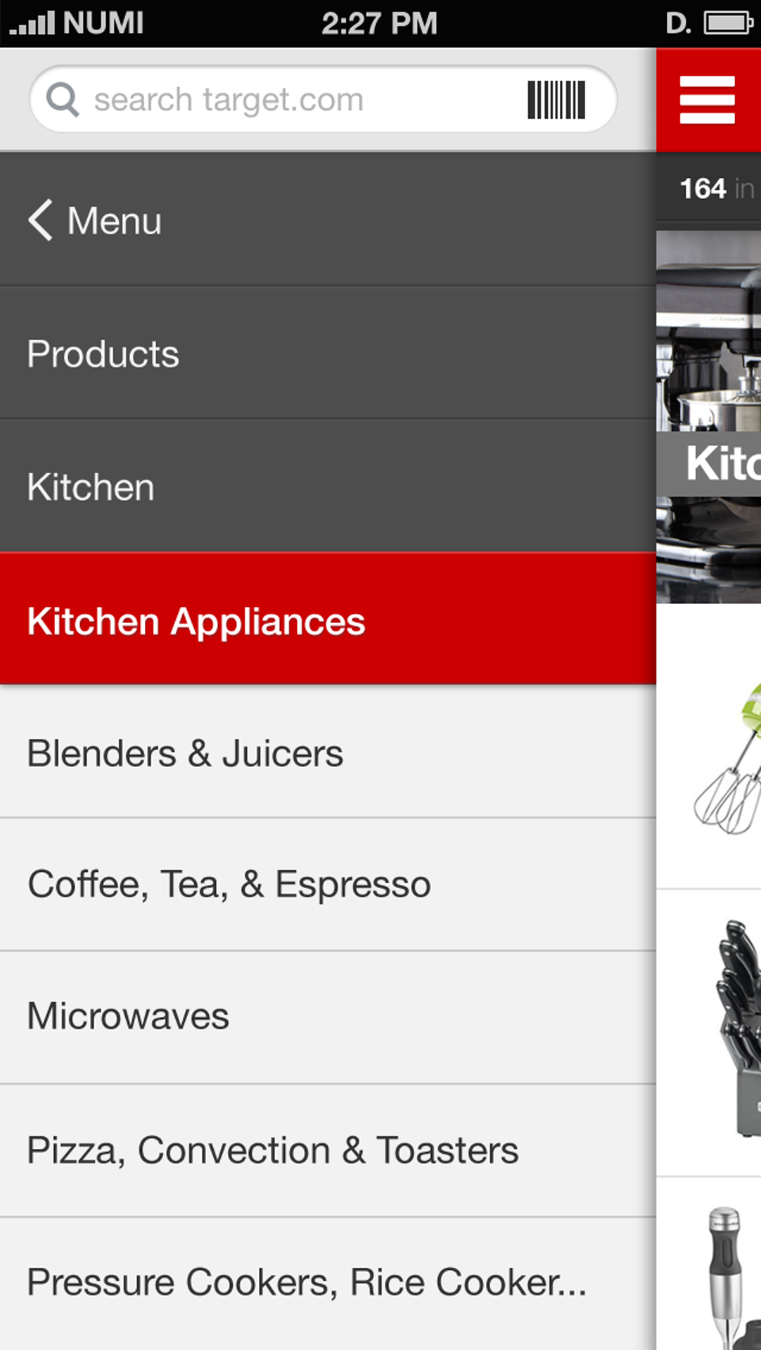
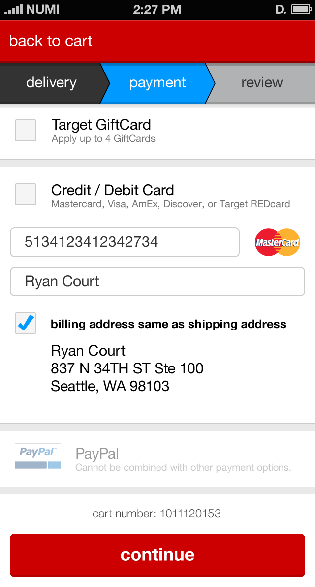
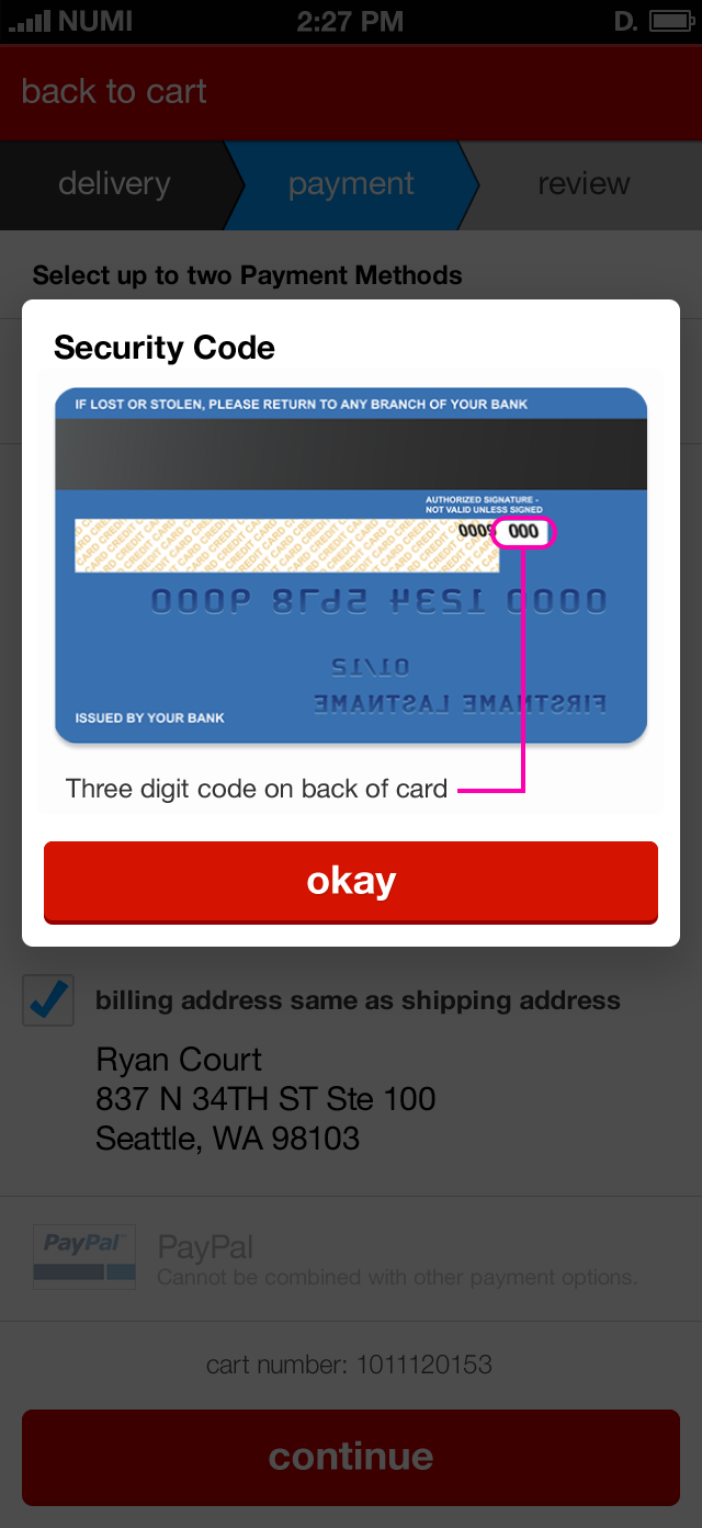
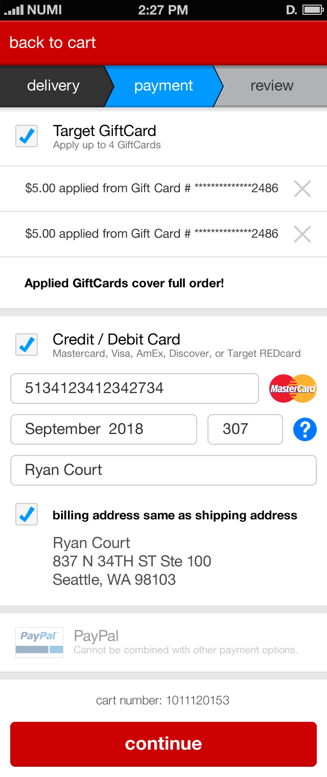
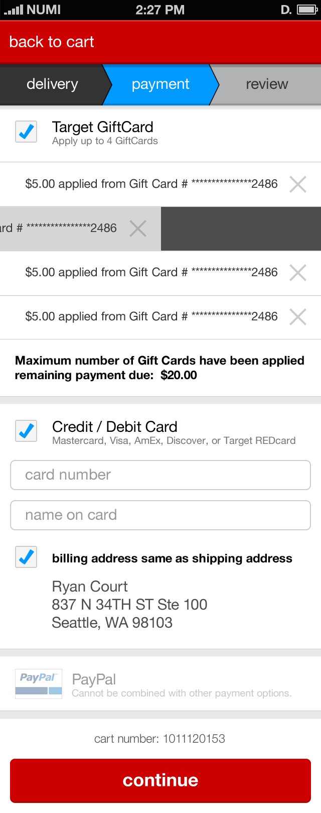
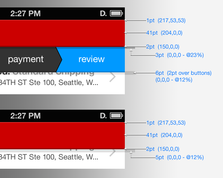
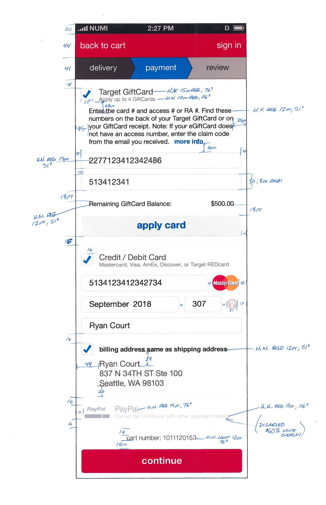
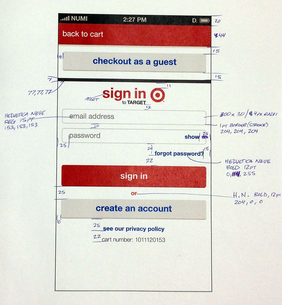
Target // iOS App
The Target iOS App team had been hard at work for nearly a year when their Visual Designer left for another opportunity, so I jumped at the chance to be the new designer on the coveted client engagement. I hit the ground “sprinting” to keep pace with the well-oiled weekly design and development cycles. It was a stellar team on both sides and a great learning experience. As a UI Designer, I loved building a native app where the pixels stay put, so to speak. I worked closely with our in-house iOS Developers and found that annotating paper printouts of my designs with “blue lines” often saved time, which was in short supply.
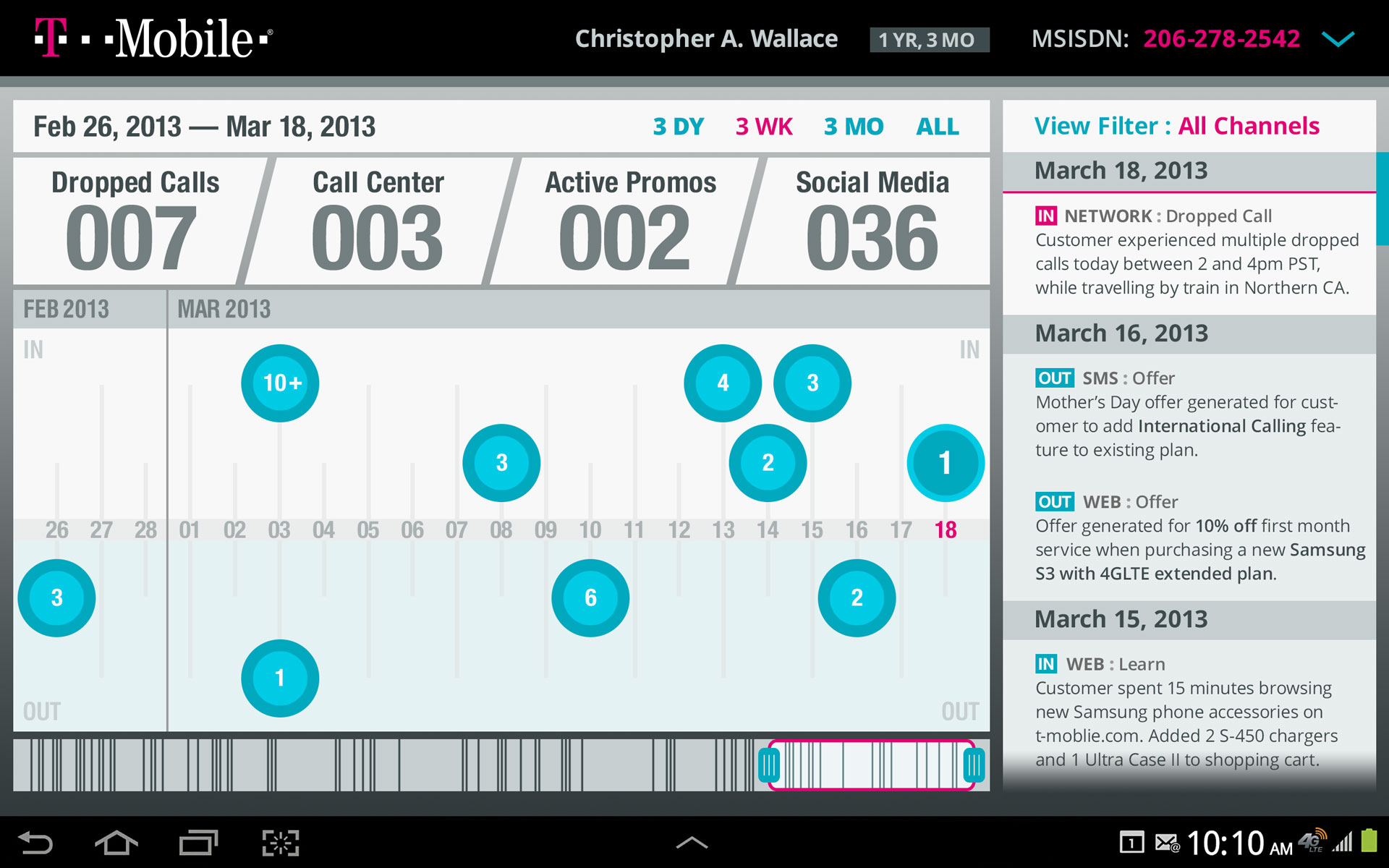
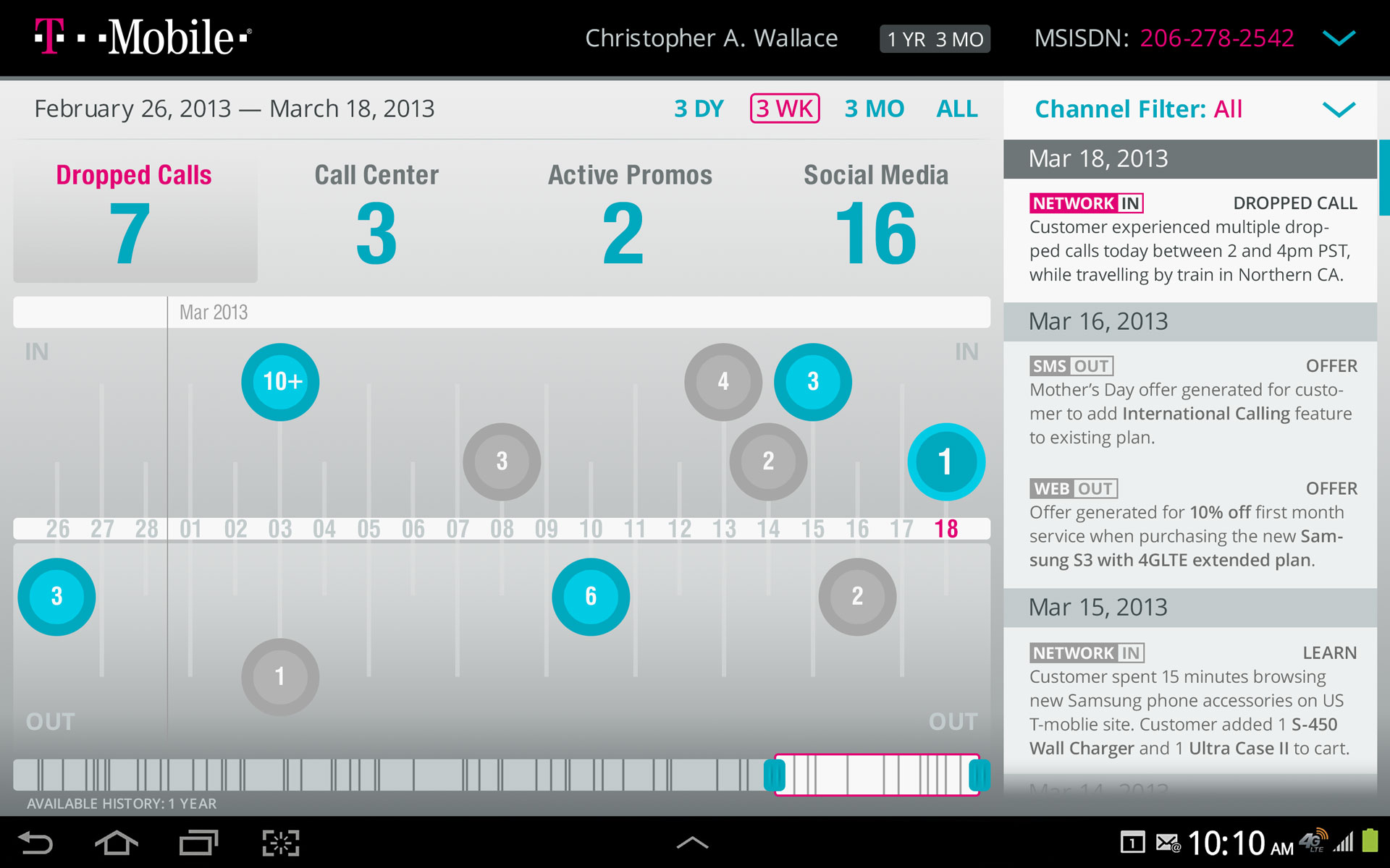
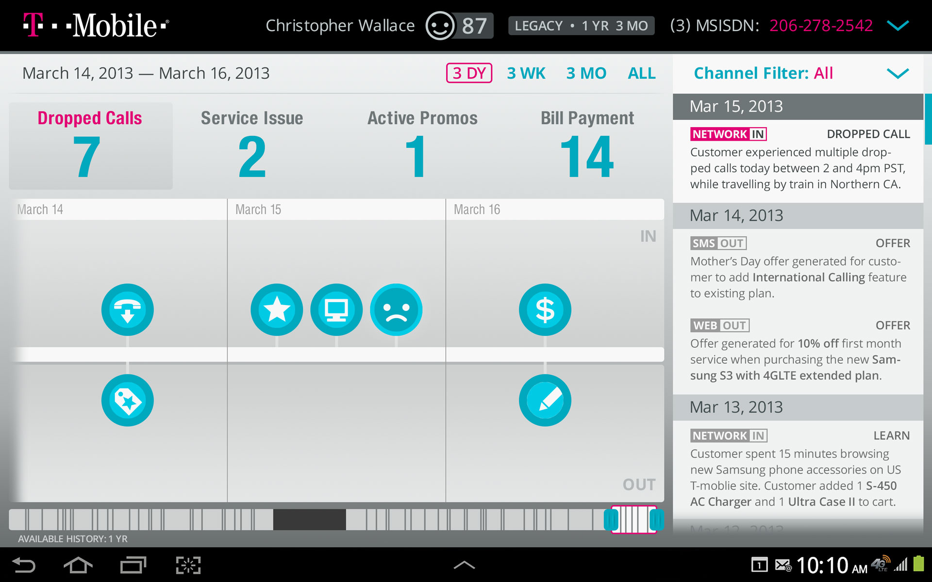
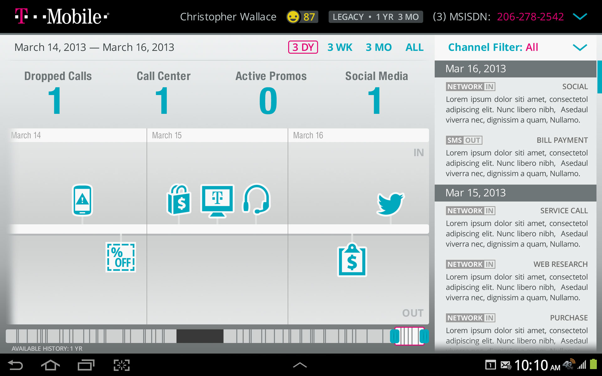
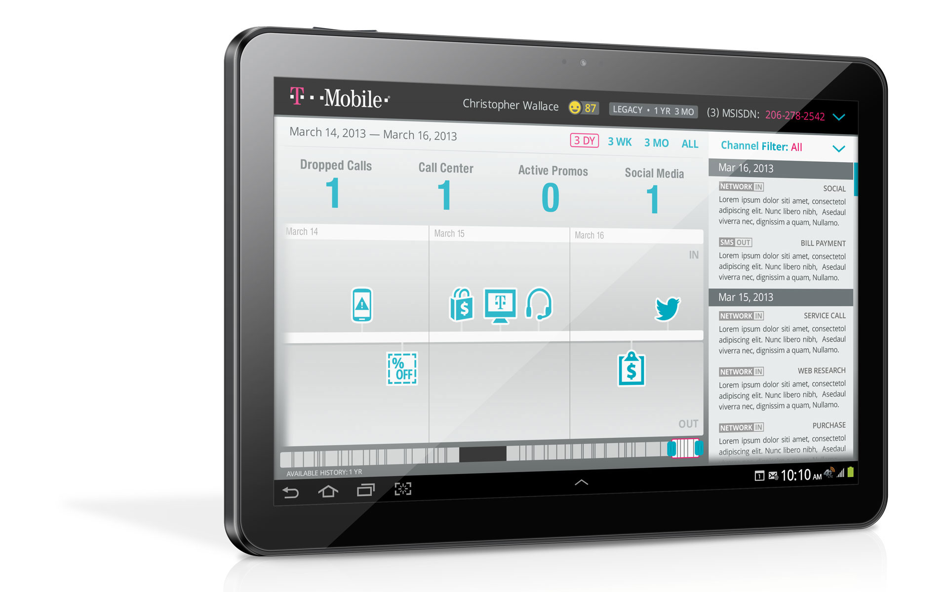
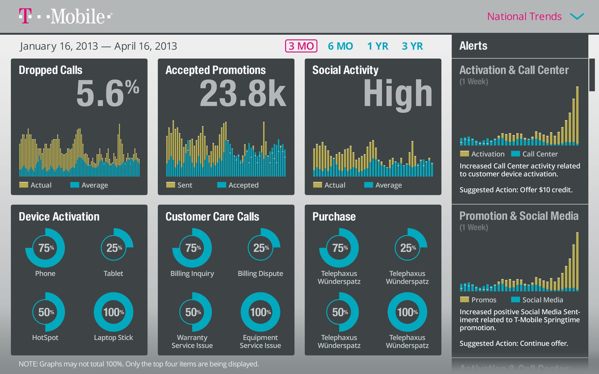
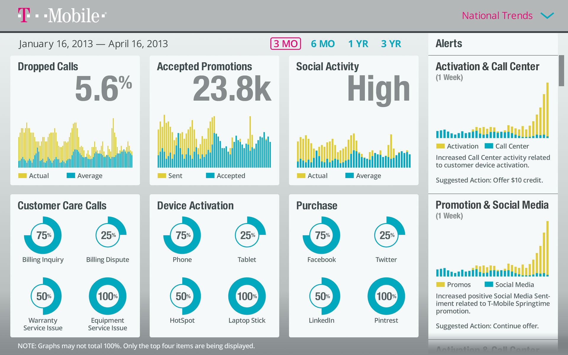
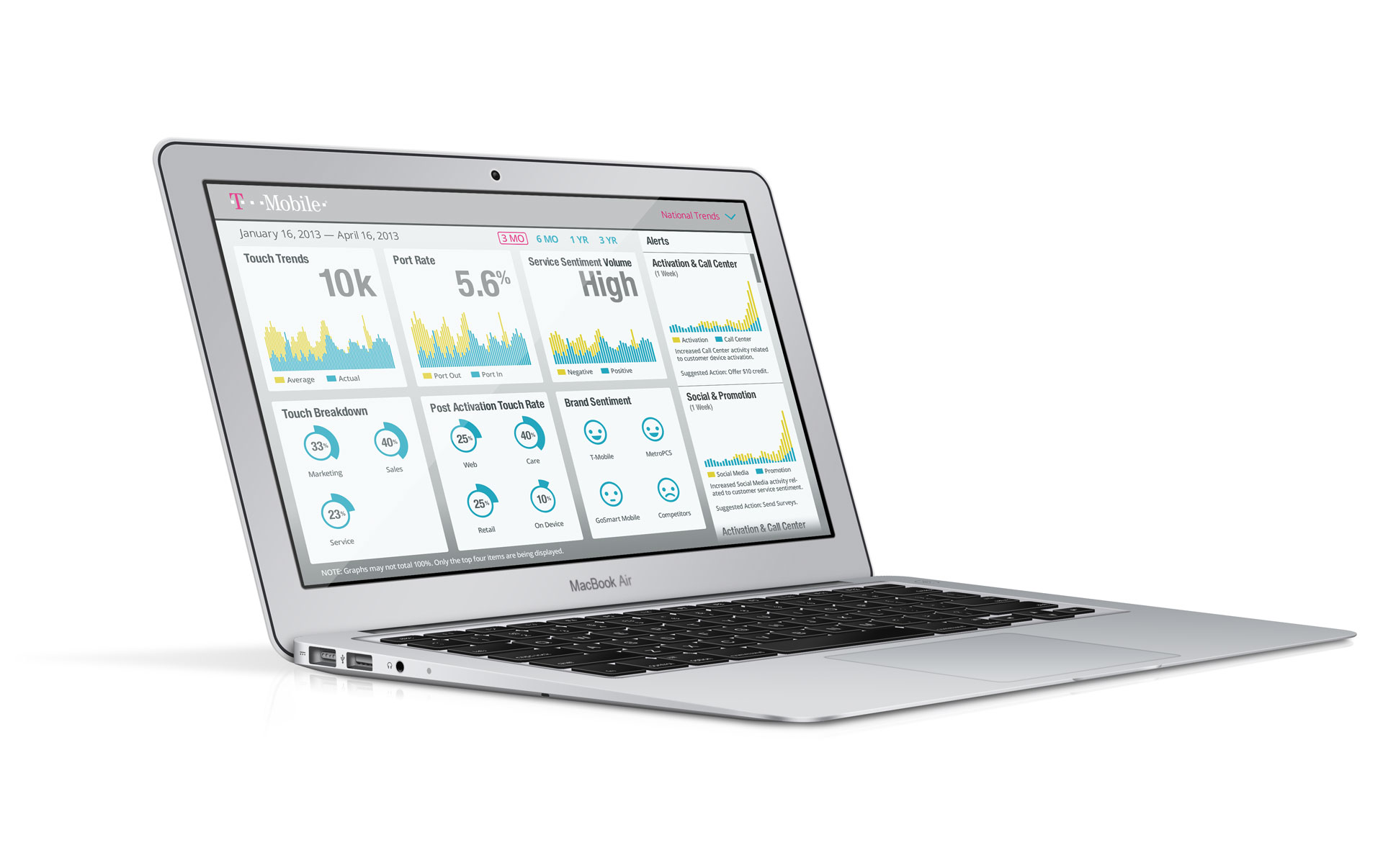
T-Mobile // Dashboard Prototypes
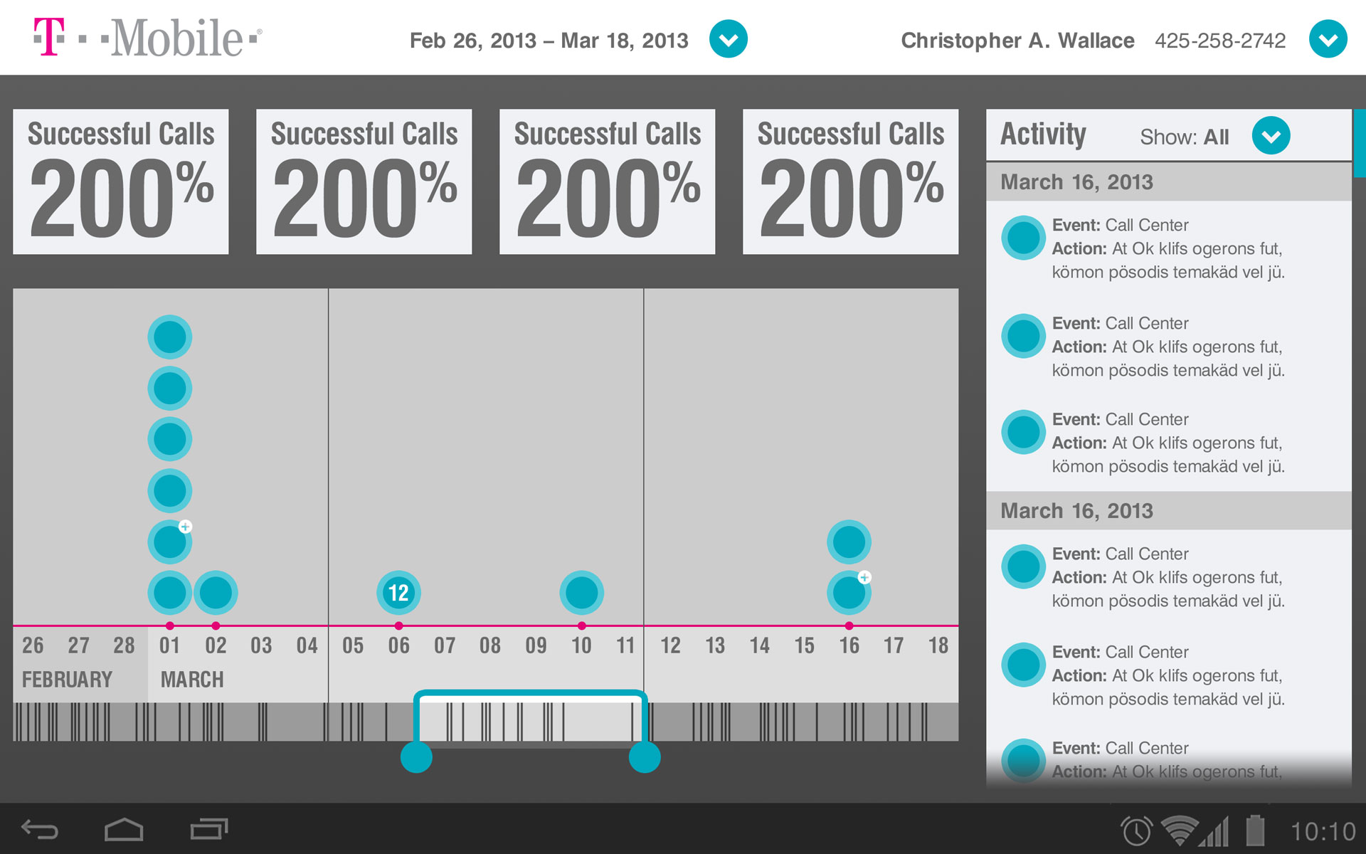
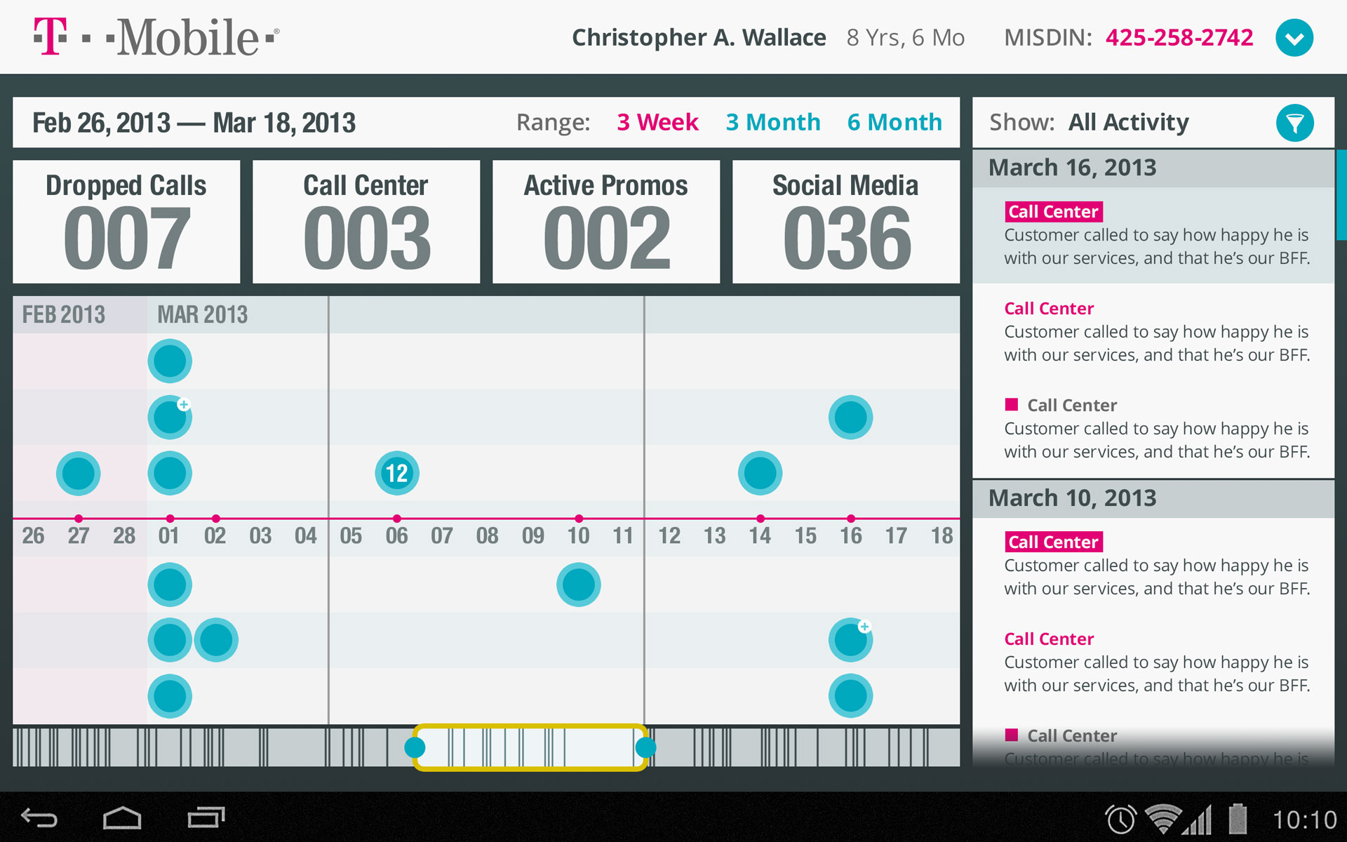
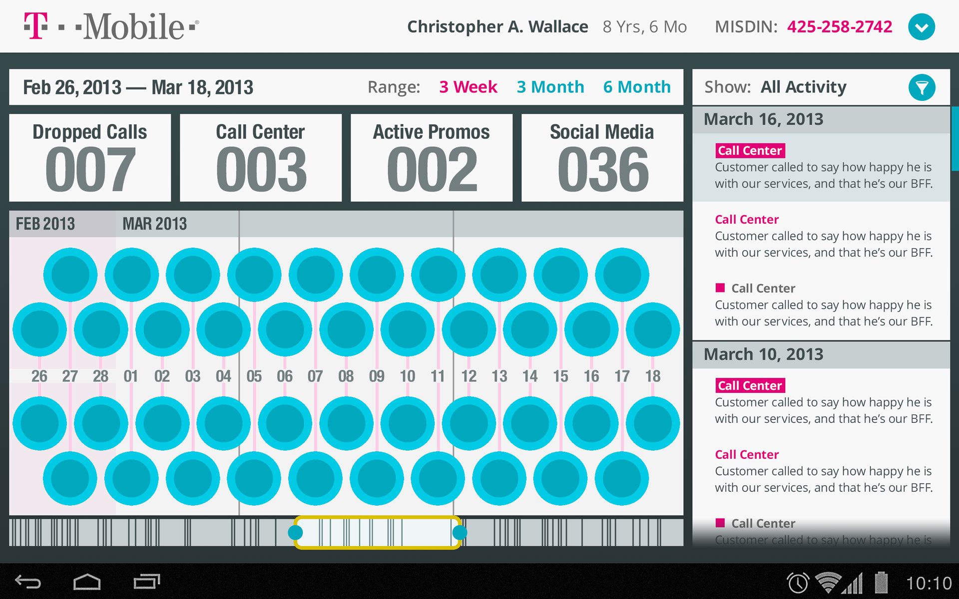
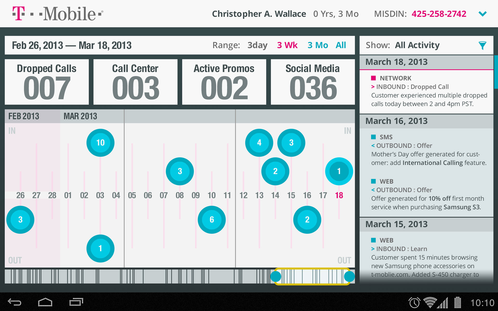
These screen iterations were of branded dashboards I designed for an internally facing product at T-Mobile. While the project stakeholders on the client side loved the end result, they pushed for the use of illustrative iconography and brand colors. The UI evolved constantly throughout the iterative process, which made for better, albeit stylistically compromised, designs in the end. As with other past projects, my initial UI sketches for these were done on dry-erase boards and/or paper notebooks that have been recycled.
Elizabeth Arden // Countertop App
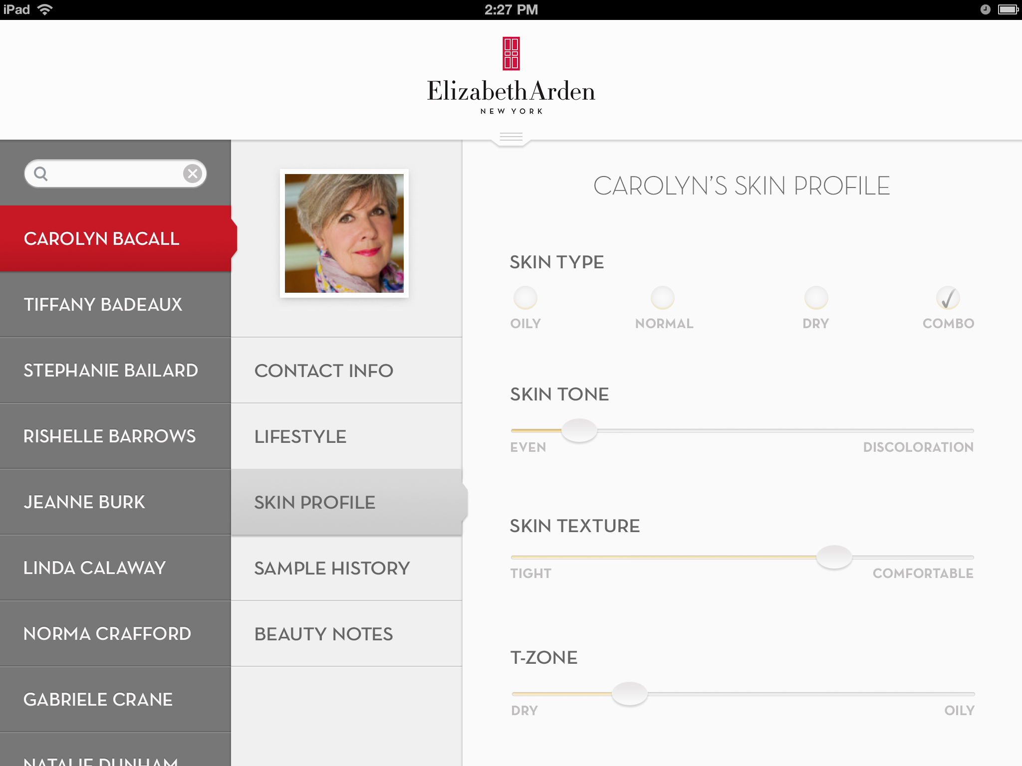
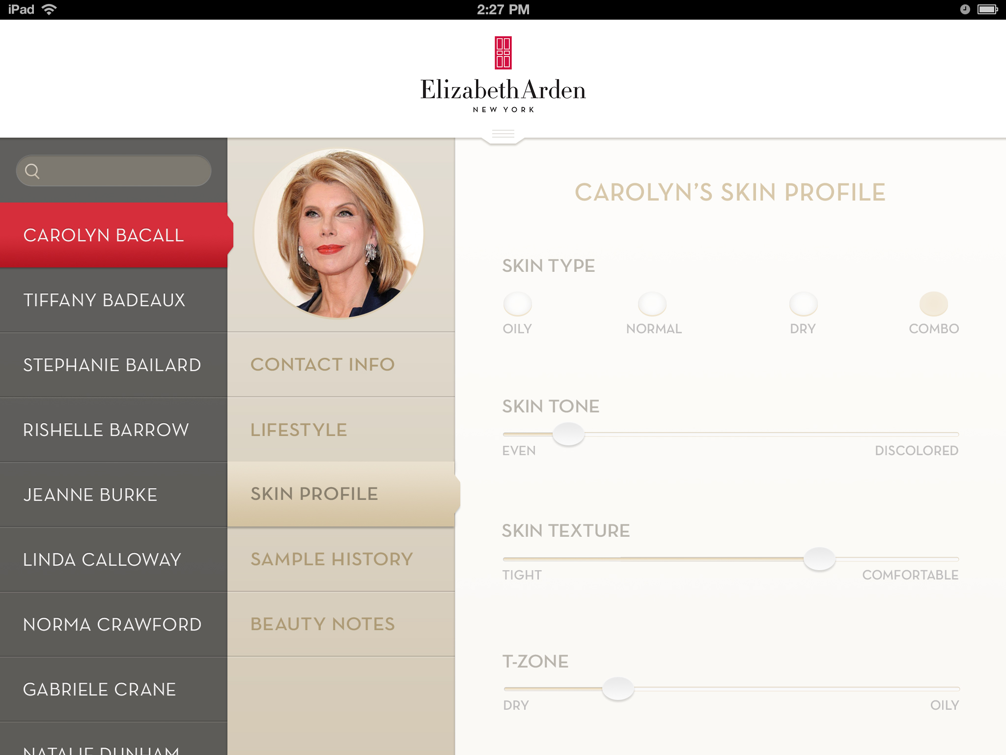
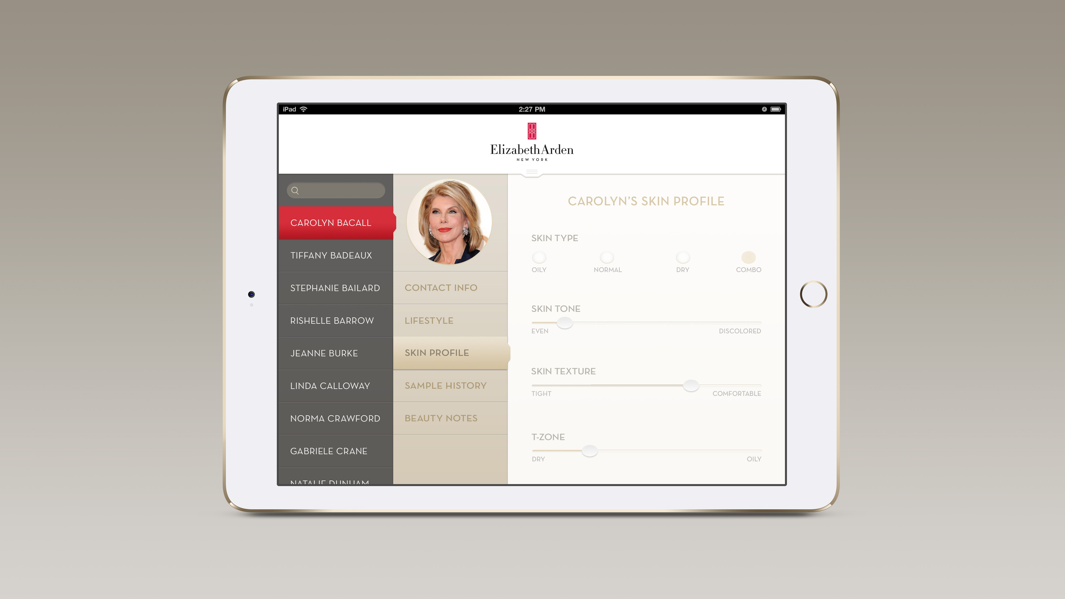
I was asked to support a pursuit effort by creating a branded, high fidelity static mock-up of a proposed iPad app that would appear polished and engaging. The pitched concept was a “countertop app” that Elizabeth Arden beauty specialists could use to better address their clients’ individual needs. With no prior brand knowledge, I was able to design this pixel-perfect comp in a single day. It was shown on device and was well-received by both our pursuit team and the stakeholders at Elizabeth Arden.
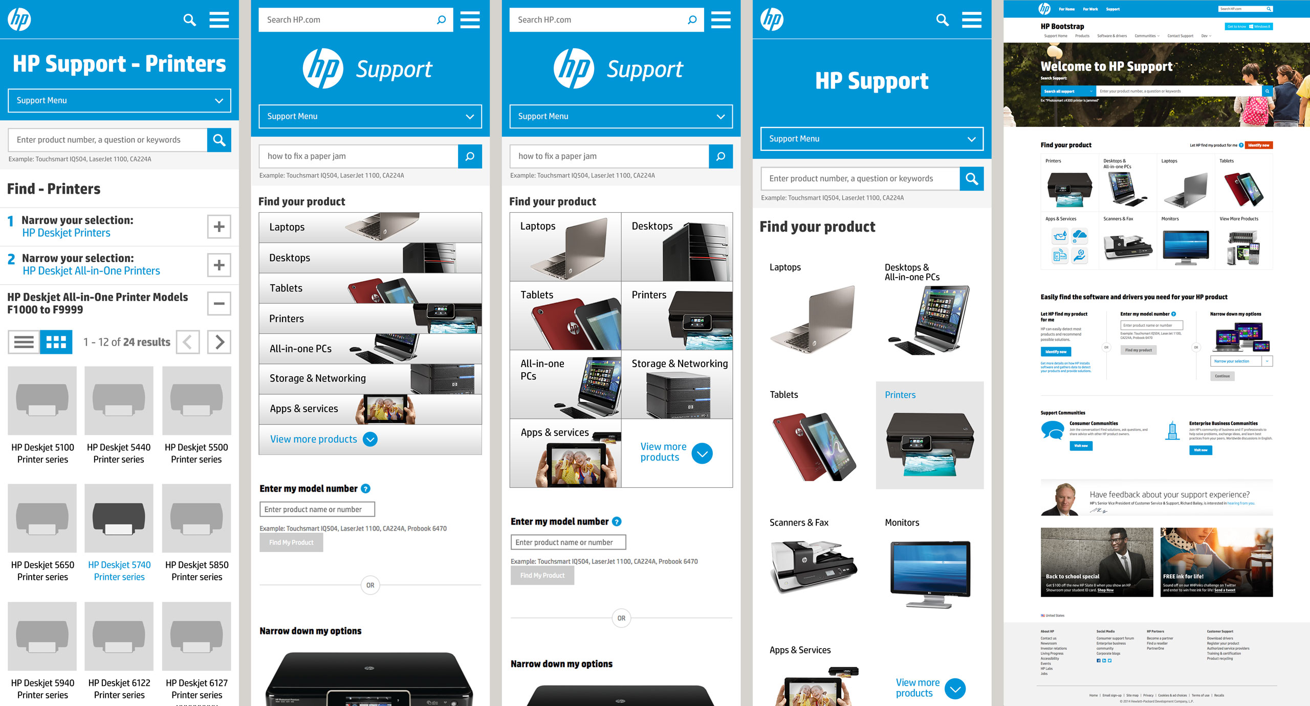
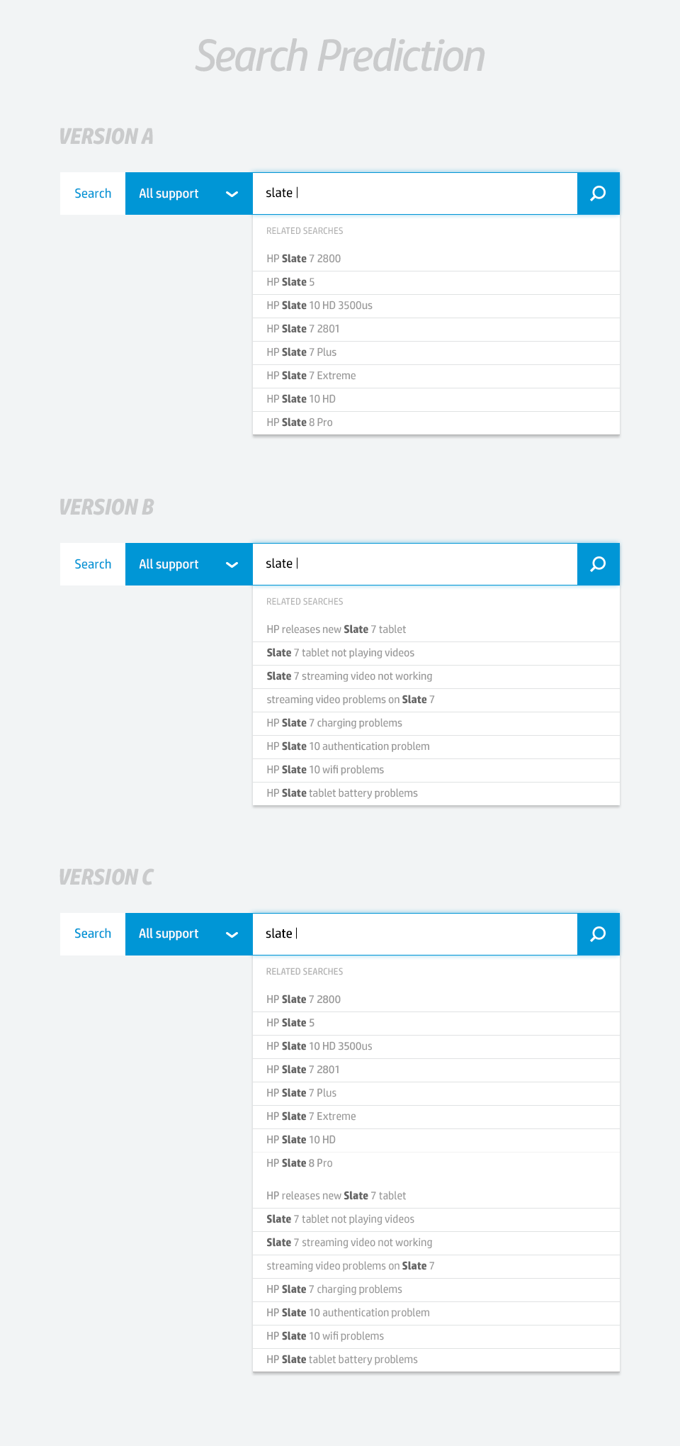
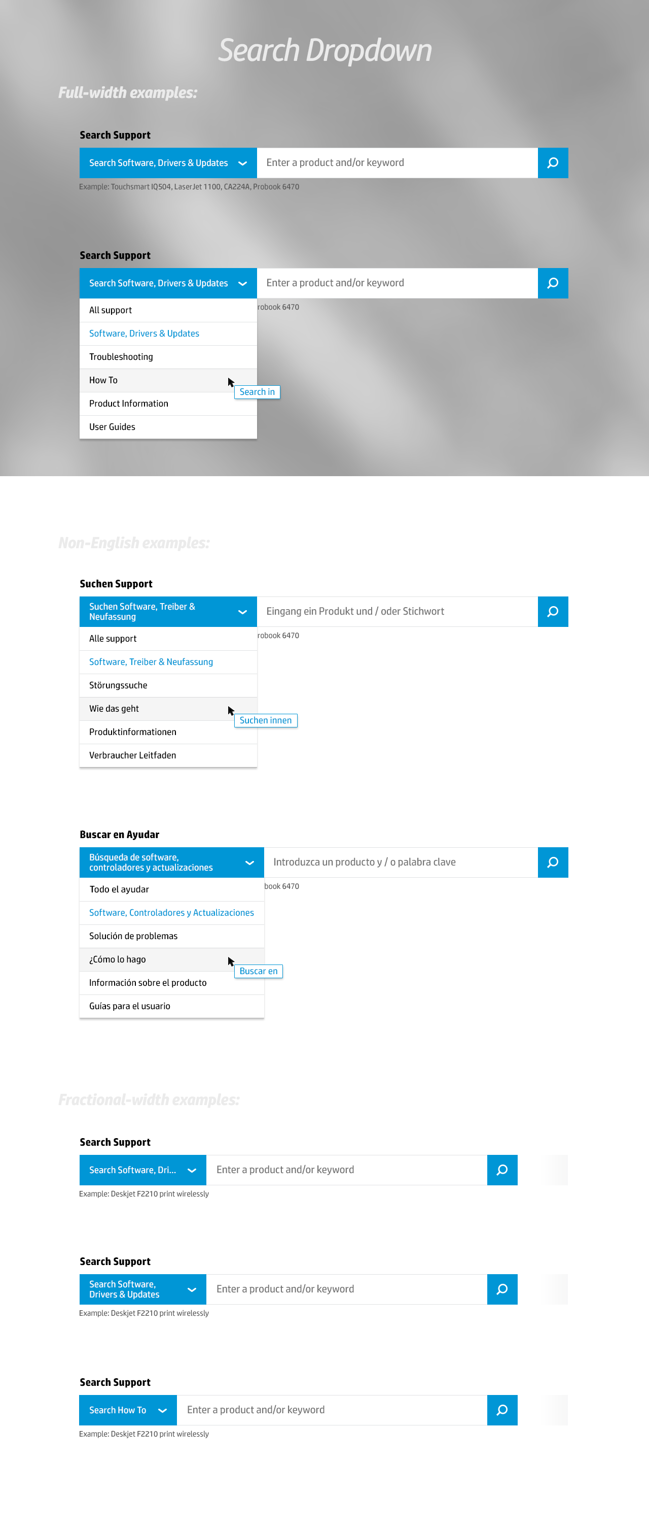
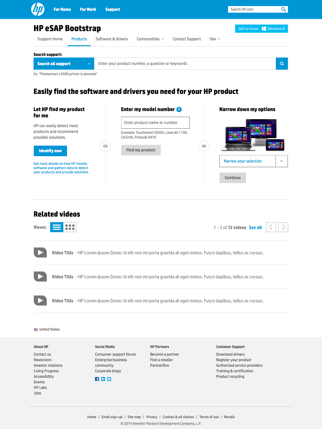
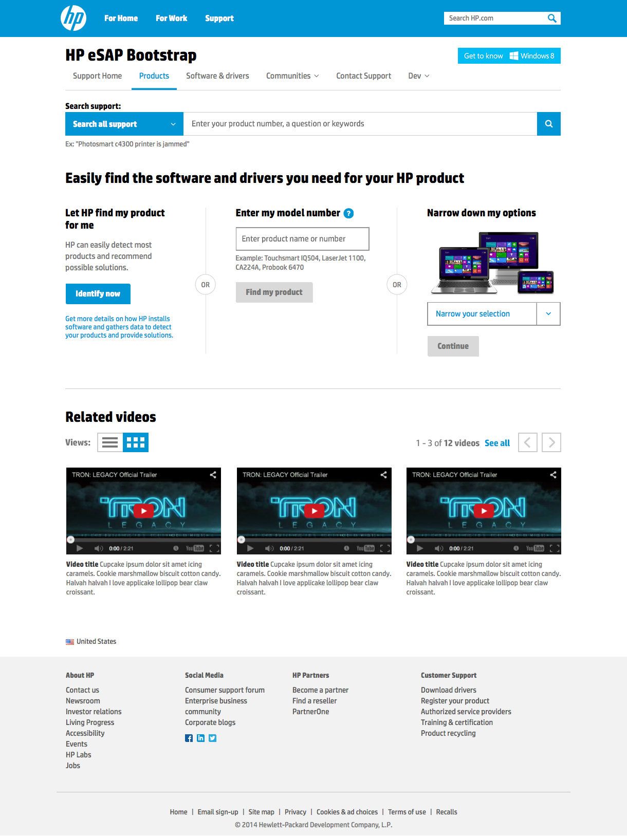
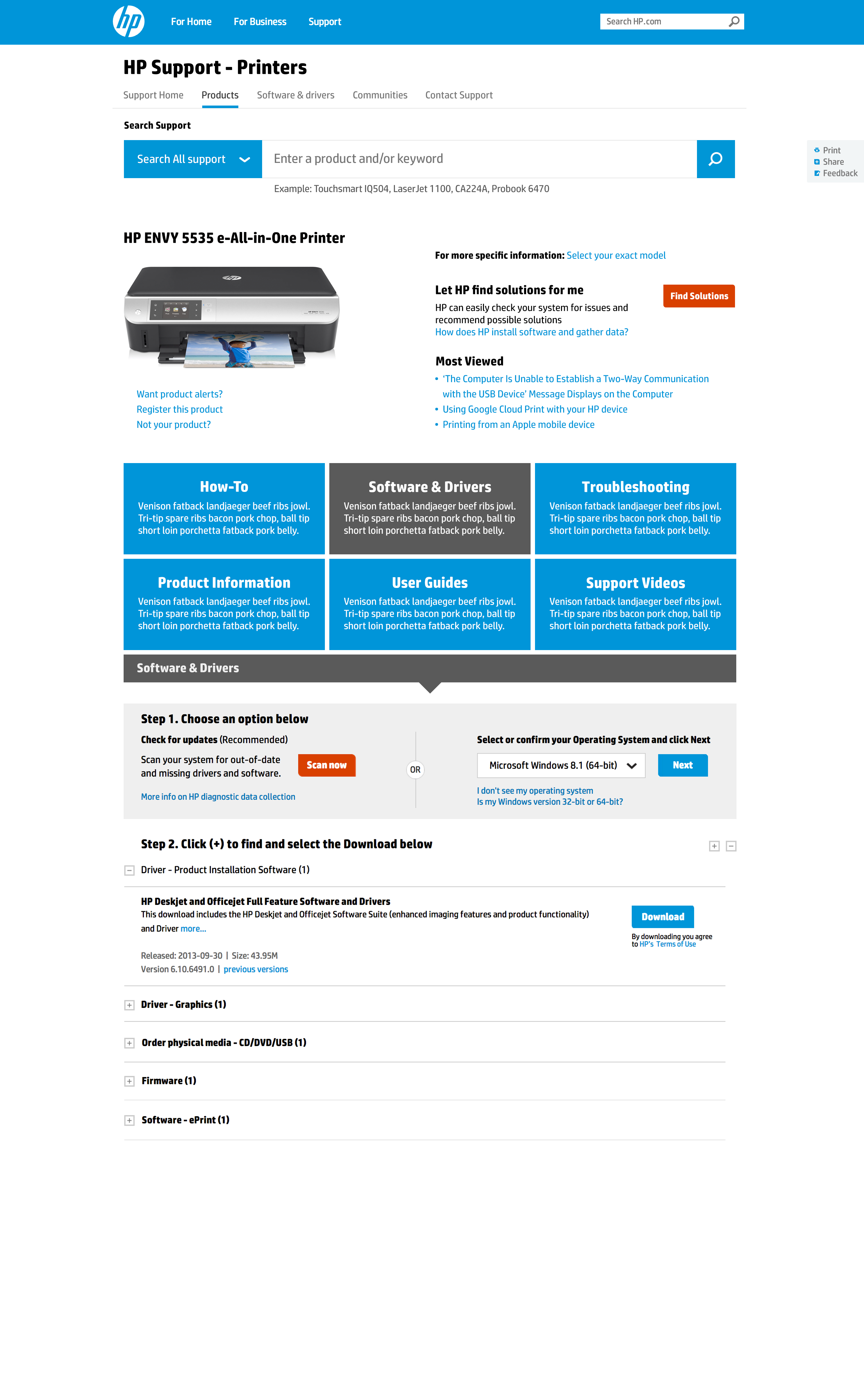
Hewlett-Packard // Product Support Site
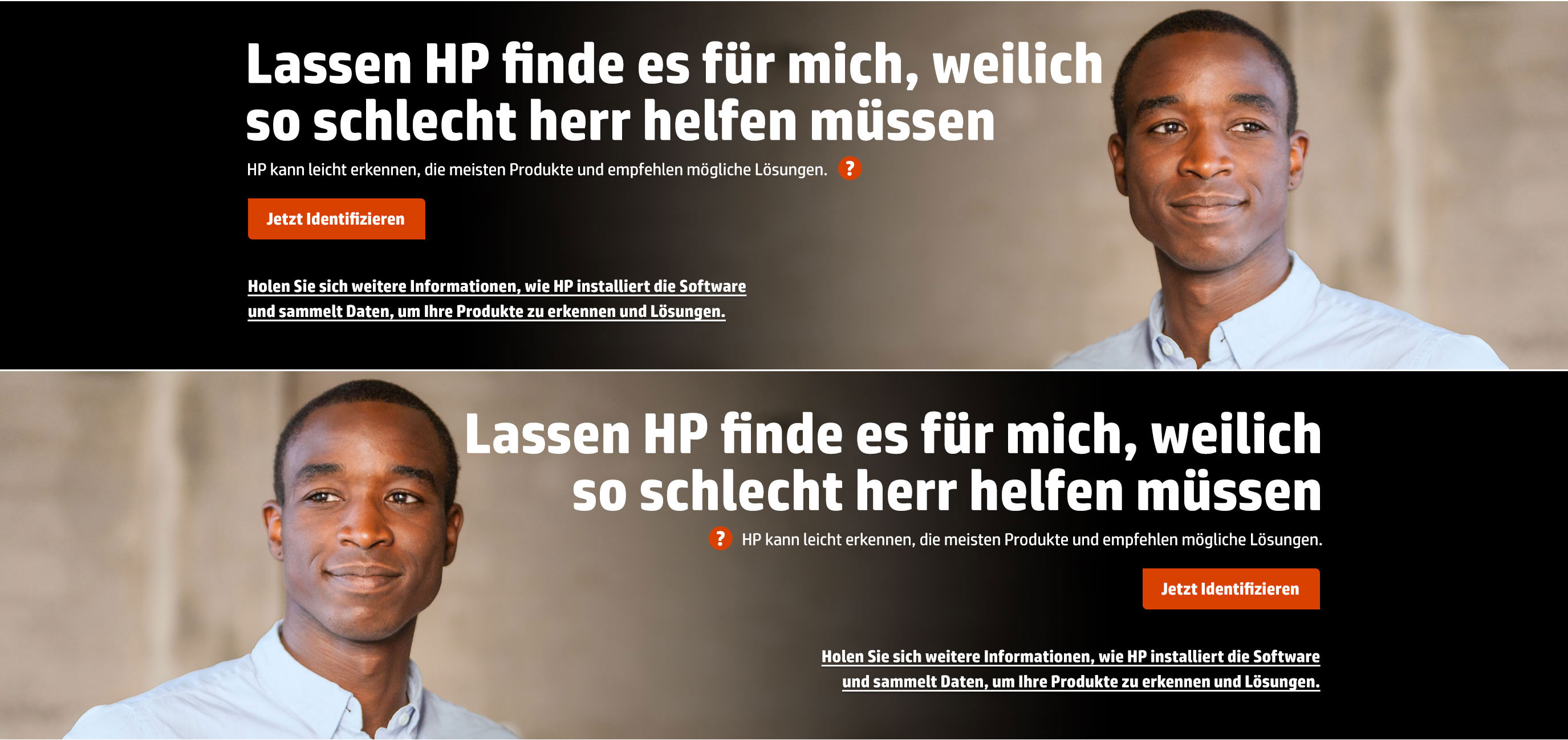
I joined the HP Product Support engagement mid-way through. My work mostly revolved around creating visual design options for various components and pages within the responsive website. Most of the challenges related to finding a balance between imagery and typography where there was a call for it at certain breakpoints. As the HP support site needed to support many languages, I also tested designs against languages with longer character counts.
Have a question or comment?
ryan@ryan-court.com
